For yourself, your own blog is always something special.
But how are the readers? Does your own blog really leave a lasting impression when thousands of new blogs are created every day?
Therefore one should make one’s own blog unique and increase the recognition. This is done with a suitable branding.
This item is part of the following series:
52 Professional tips to improve your blog
What is branding?
![]()
Branding comes from the English term ‘Brand’, which means ‘brand’.
So it is about making your own blog a kind of brand, whereby a brand consists of a lot of factors and arises.
One factor is the outward appearance, and that’s the point today.
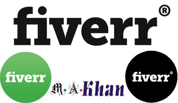
Logo
Often the term brand is equated with the logo. This is not correct, because much more belongs to a brand, as indicated above, but it also shows how important the logo is.
Many people are especially aware of the logo. Therefore you should use a logo for your own blog and use it permanently.
This does not necessarily have to be a creative logo, even if you can create quite good things easily and cheap with the help of some online tools.
I’m more focused on logos that contain text. This is under the category Wordmarks.
The names of my blogs “M.A. Khan” and “Fashion Vela” can be found in the logo. Partially there is still a supplementary element, which I however very easy keep.
Establishing an image logo is more complex and requires more explanation. For blogs, this is often not so ideal.
Here you will find tips for designing logos.
Name & Slogan
In addition to the name of your own blog, which you should carefully select, there is also the possibility to use a slogan for the branding.
This is a short sentence, which is usually displayed under the logo and also appears on the blog from time to time.
This slogan is particularly important and useful when the content of the blog is not easily accessible from the Blog name/logo.
This is why you should be able to clearly and clearly state what the blog offers and what the reader has. It is not so easy to summarize this in a few words. But the better one gets the better, the faster the readers grasp what it is and the clearer the added value.
Fonts
Another possibility to make your own blog visually distinctive is the consistent use of fonts.
So you should choose a font for navigation, headlines and other special areas (such as Sidebar) and stick with it consistently. By means of web fonts, e.g. From Google, it is very easy to integrate a different font than the typical fonts into your own website. And all readers get this font also displayed.
So I use e.g. On my blog in the sidebar, navigation and heading the font ‘Oswald’, which is provided by Google free of charge.
However, you should not be creative here and choose a different font for each element. This looks unprofessional and reduces the recognition value.
To Dye
Colors are also very important. These shape a blog and make certain associations.
Again, I think it is important that you decide for a color scheme and then remain. If you use a simple color scheme, this makes the site look more like a single piece.
In addition, this has the advantage that pictures or even a teaser notice noticeably stronger than if the whole blog eh already Kundbund is.
Conclusion
All in all, it makes the combination of course. Thus, the color scheme used should also be reflected in the logo.
Especially for WordPress bloggers, it is actually quite easy to implement a good branding. Much of the theme now offers extensive optical customization possibilities, so you can create an individual layout very easily and quickly.